GMK MTNU vs KAT Keycaps: Best Deep-Dish Sculpted Rows for Writers
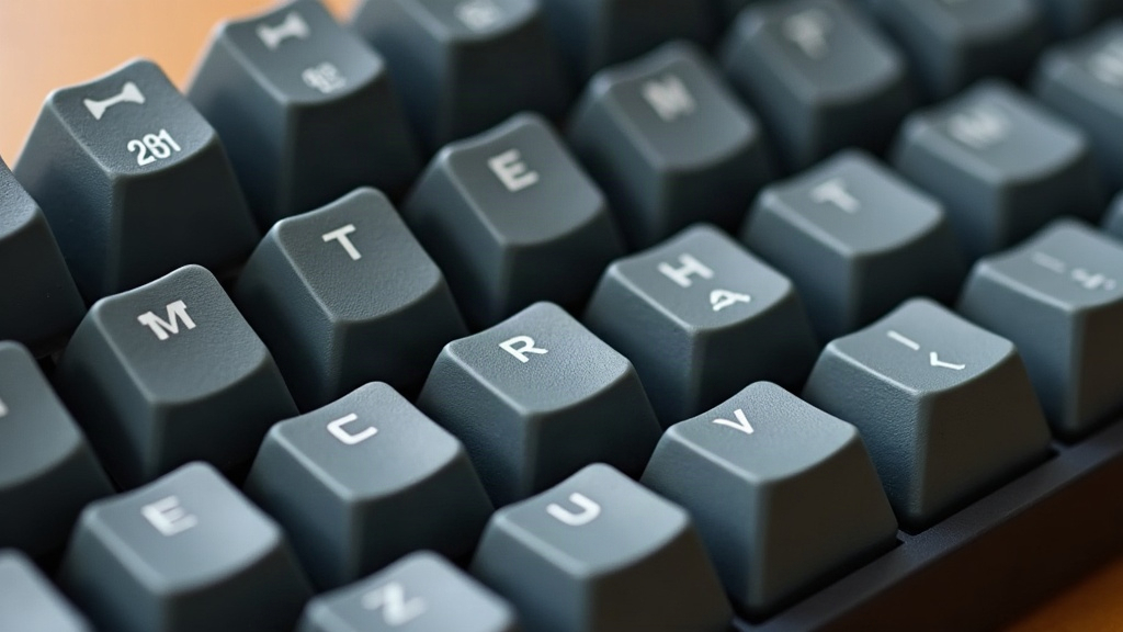
If you spend hours a day writing (articles, novels, code docs, emails, whatever pays the bills) the shape of your keycaps matters more than most people give it credit for. GMK MTNU and KAT are two of the go-to choices for anyone chasing that deep-dish, sculpted-row feel, but they get there in pretty different ways. GMK MTNU goes tall and aggressively scooped, classic Cherry-style profile, wrapped in a muted retro colorway. KAT takes the opposite route: shorter, rounder, more uniform across rows, and a lot of typists find it easier on the fingers once the hours start piling up. Below is a breakdown of how each one actually performs during sustained writing work, so you can pick the one that fits your hands (and your desk) instead of just going with whatever’s trending.
What “Deep-Dish Sculpted” Actually Means
A deep-dish profile is really just a measure of how pronounced the concave scoop is on each cap, especially across the home row and the rows below it. The deeper the dish:
- The clearer the resting groove for your fingertips, which cuts down on slips
- The more tactile feedback you get from shape alone, before the switch even activates
- The more “locked in” it feels for touch typists
- The more fatiguing it can get if you type with flatter finger angles
Both GMK MTNU and KAT get a lot of love in enthusiast circles precisely because they commit to this style, instead of the flat, forgettable profiles you find on most budget sets.
GMK MTNU: Tall, Classic, and Deliberately Scooped
MTNU is a Cherry-profile set, meaning each row is sculpted with its own height and angle, and it sits noticeably taller than a lot of modern alternatives. Ask writers who like it and you’ll hear the same points come up again and again:
- A very defined dish on R1 through R3 that keeps your fingers centered through long sessions
- A slightly higher typing angle, which some people find eases wrist strain, especially on a keyboard tented or raised at the back
- Doubleshot ABS construction, so legends don’t fade and the plastic stays grippy for years rather than months
- A warm, muted “dolch/mountain” look, nothing flashy, but it ages well both visually and in feel
The catch: because MTNU sits tall, switching to it from a flatter profile (Cherry-lite, OEM, whatever) can feel like a real jump. Plenty of writers need a week or two before the deep dish stops feeling grabby under their fingers.
KAT: Shorter, Rounder, and More Forgiving
KAT caps run shorter overall, with a rounder, more uniform dish across the rows. For someone writing for a living, that translates into a few concrete things:
- Less finger travel per keystroke, which matters when you’re six-plus hours into a writing day
- A smoother, rounder landing zone that’s friendlier if your finger posture runs flat rather than curled
- A quieter sound signature, thanks to the shorter cap walls
- Often a lower price tag than GMK’s premium doubleshot runs
The catch here: KAT’s dish, while still deeper than anything generic, is noticeably less dramatic than MTNU’s. If you’ve already fallen for that theatrical Cherry-style scoop, KAT can feel almost flat by comparison after you switch.
Head-to-Head for Long Writing Sessions
| Factor | GMK MTNU | KAT |
|---|---|---|
| Dish depth | Very deep | Moderately deep |
| Typing height | Taller | Shorter |
| Finger fatigue (long sessions) | Can increase if unadjusted | Generally lower |
| Sound | Deeper, more clacky | Softer, rounder |
| Price point | Premium | Mid-range to premium |
| Legend durability | Doubleshot ABS, long-lasting | Usually doubleshot ABS/PBT depending on run |
Which Should Writers Choose?
- Go with GMK MTNU if you type with a more upright wrist position, want the most tactile definition row by row, and don’t mind a short break-in period.
- Go with KAT if you’re writing for hours on end, want lower finger travel, or you’ve already had wrist or finger fatigue with taller Cherry-profile sets.
- Still on the fence? Grab a cheap KAT-profile sample set first. Its gentler scoop is easier to adjust to, and within a week you’ll know whether you actually want to go deeper with MTNU.
Final Thoughts
Both sets deliver a genuinely deep-dish, sculpted typing experience that beats flat, generic keycaps hands down, but they solve the “comfort over long writing sessions” problem from opposite directions. MTNU rewards typists who want pronounced structure and don’t mind standing a little taller at the keyboard. KAT rewards people prioritizing reduced fatigue across multi-hour stretches. For most writers, the right pick comes down to hand posture and how long your sessions actually run, not hype. If you can swing it, test both before committing to a full premium set.